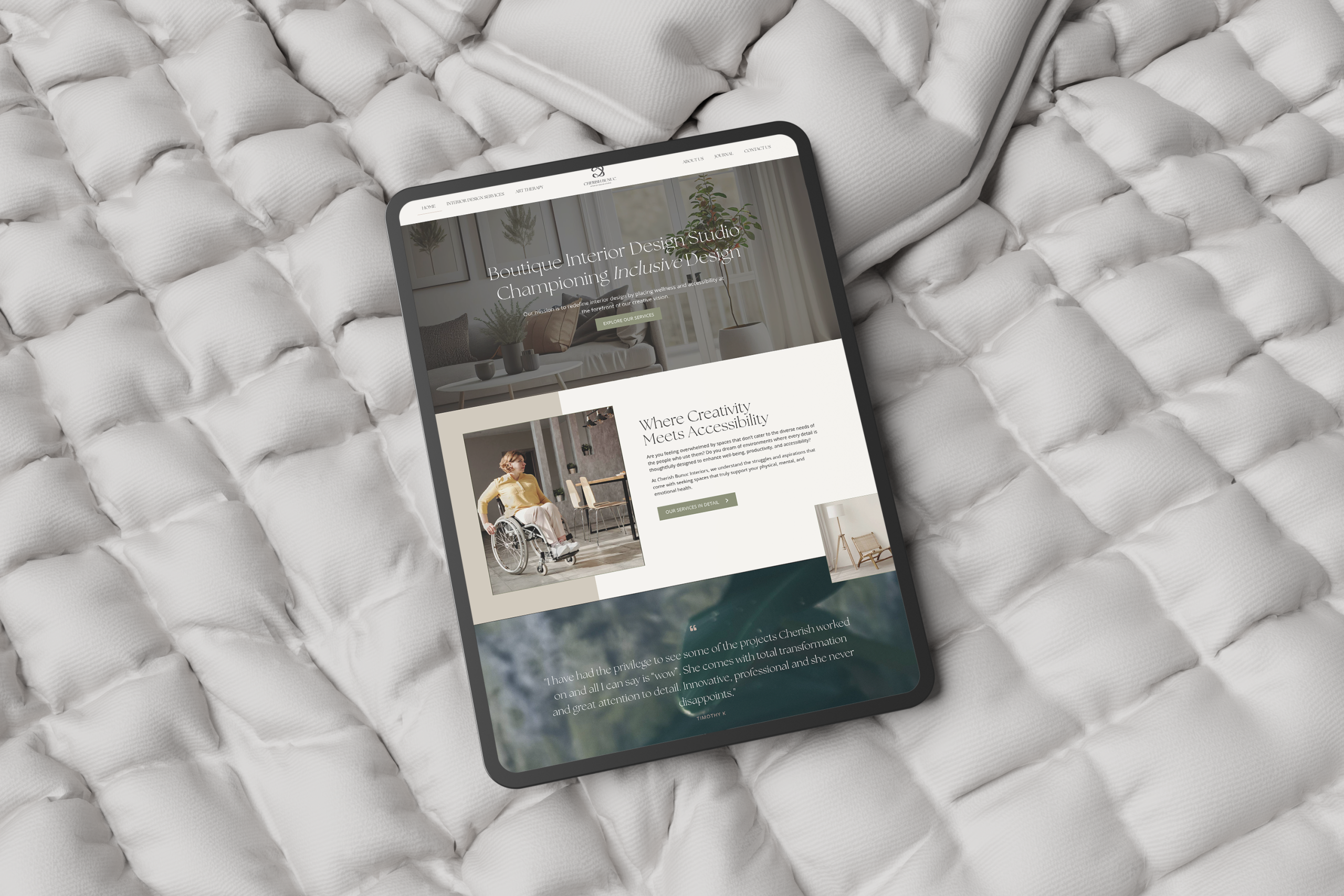
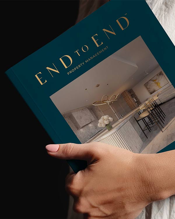
Brand Identity · Photography Direction · Stationery Design
The brief
brief goes here
The new identity
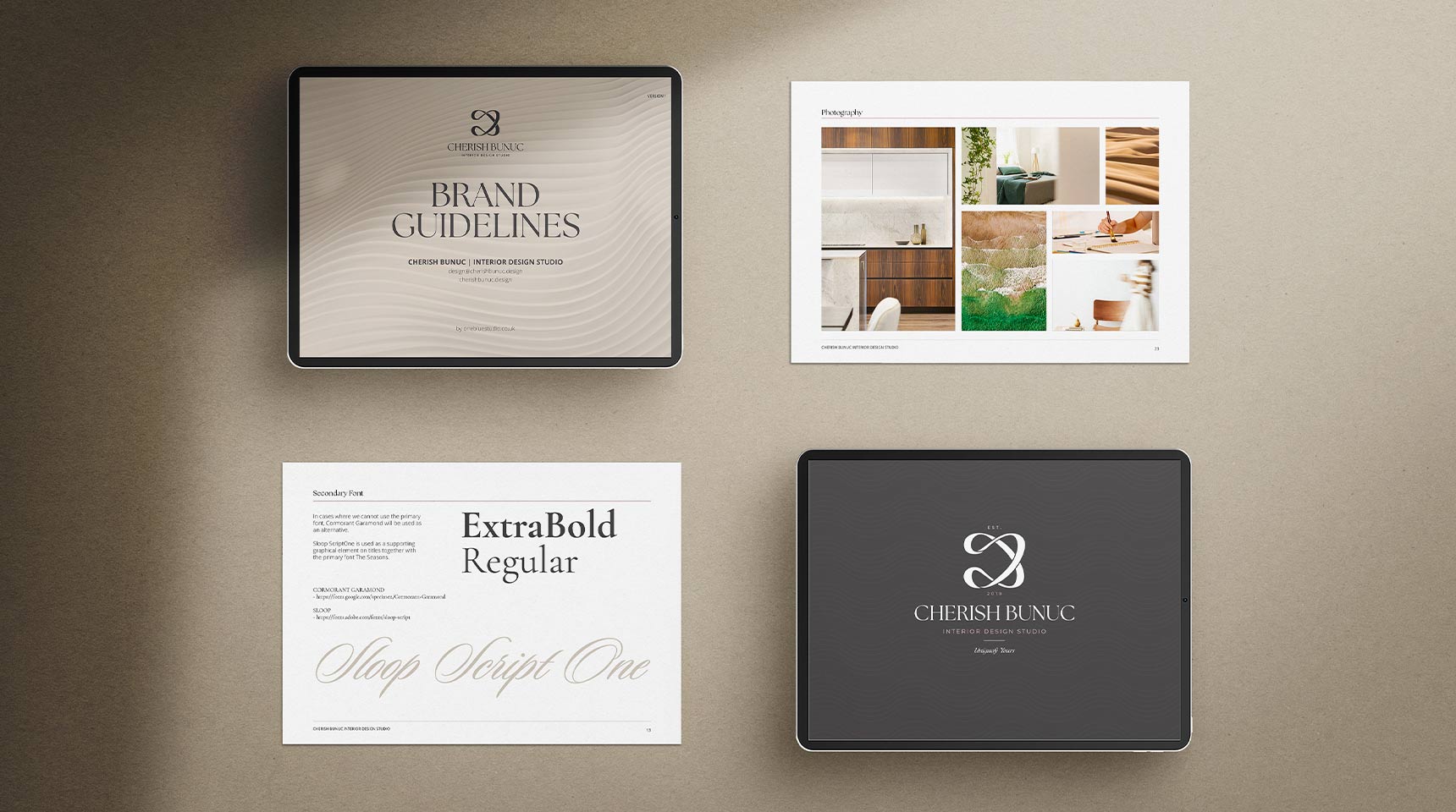
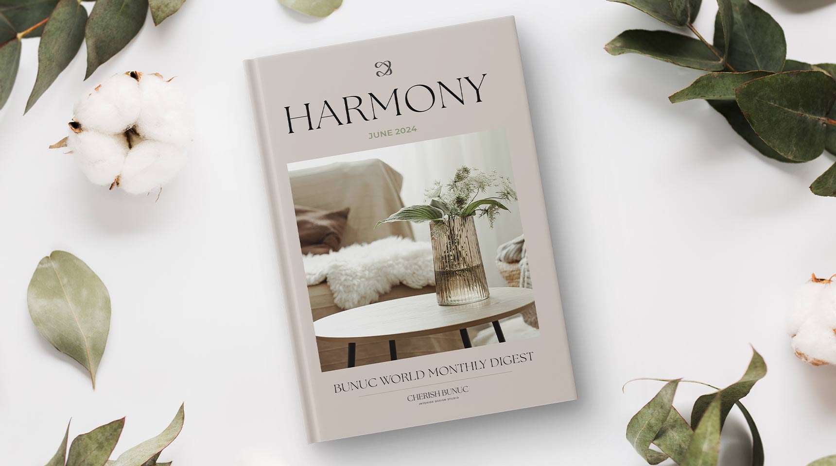
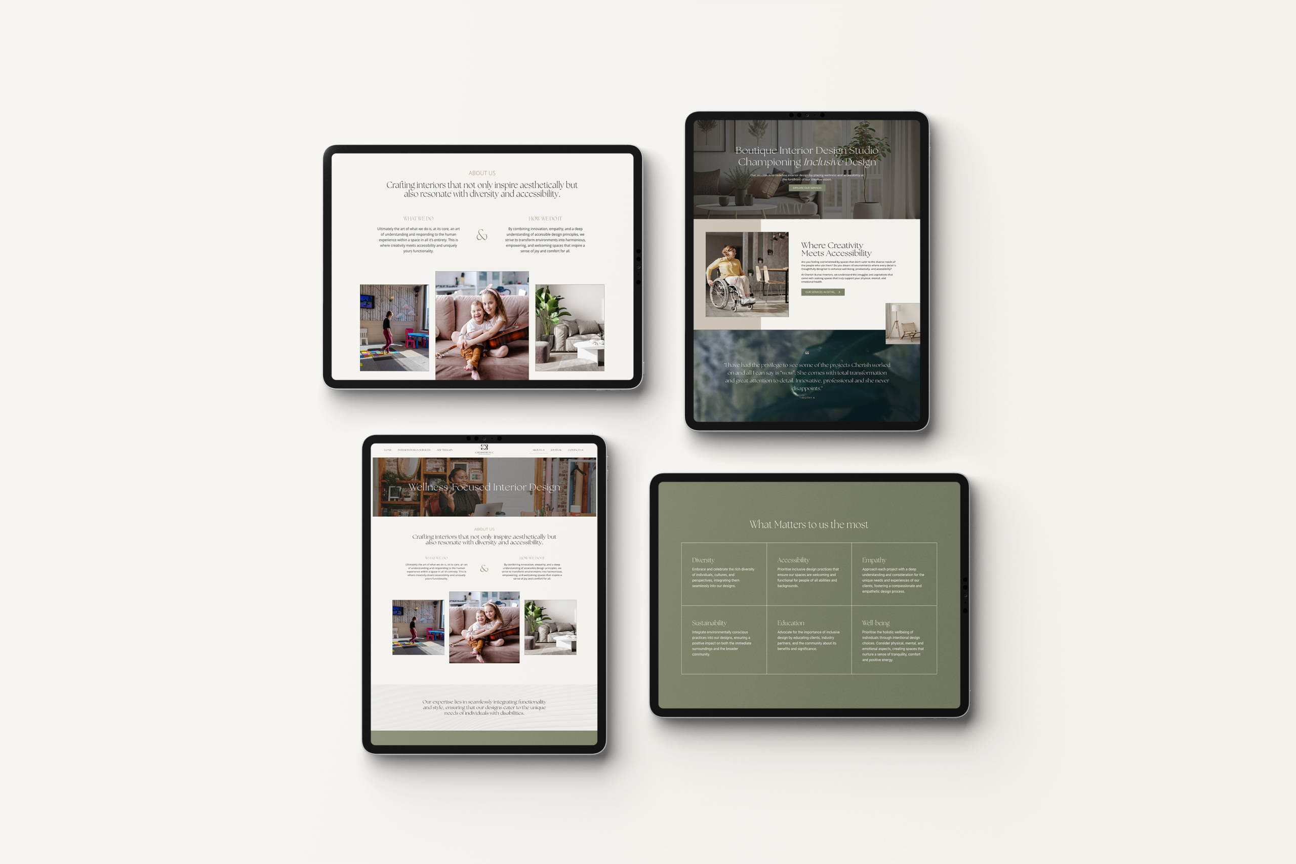
REPLACE THIS SECTION!! A flexible visual system was developed across:
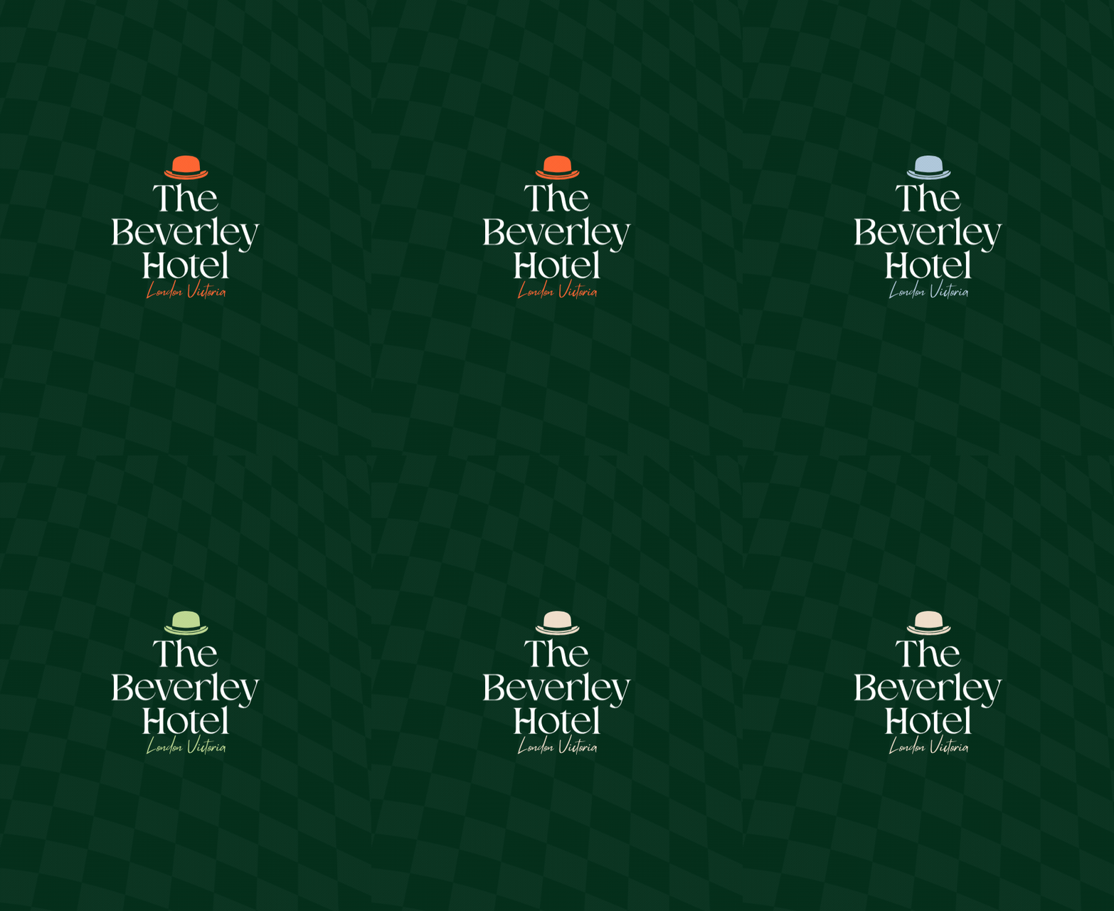
LOGO – Refined primary and secondary marks
TYPOGRAPHY – A distinctive typographic hierarchy for brand and digital communications
COLOUR – A refined palette balancing heritage with a contemporary feel
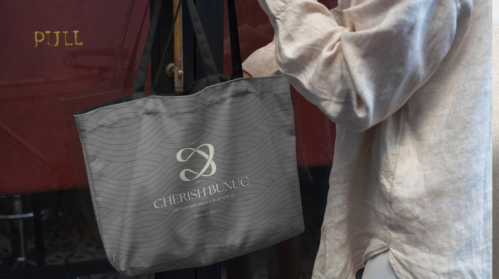
PATTERN – A graphic language adding personality and consistency across applications
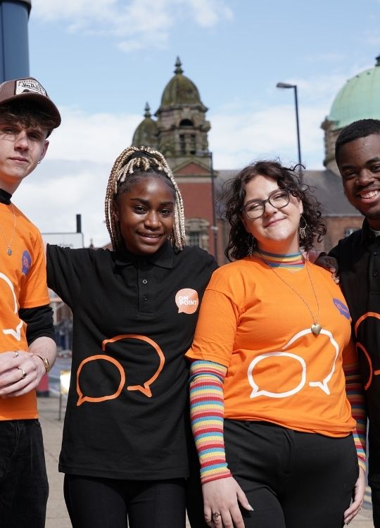
PHOTOGRAPHY & ART DIRECTION – Photography was developed as an integral part of the brand, capturing the property’s architecture, interiors, atmosphere and details. The aim was to create imagery that felt authentic to the hotel and gave prospective guests a stronger sense of the experience before they arrived.